Yes, looks like another K-Pop post. But this time I’m not writing about the music. I’m even not writing about the people who perform the music. Today I’m writing about just how damn shinily those Koreans wrap up their products. Because it is, quite frankly, on another level, and it is, quite honestly, ridiculous.
At the end of last year I touched on just how important presentation can be to me in my Top Ten Game Cases of 2012 list. I’m the kind of person who genuinely got goosebumps at Apple’s colour-soaked iPod Nano ads from the latter part of the last decade. Good presentation is like a drug to me; it’s a weakness, God knows it really is.
Anyway, yesterday, this happened:

No really, I can explain.
You see, last week my sister and I were to attend a rather ambitious and rather expensive multi-label K-Pop concert, one which I was eager to experience and eager to write about on this very blog. Without pointing any fingers and taking this post too far off-track, let’s just say the Australian organisation in charge of planning the event didn’t quite play by the rules and the concert was “postponed indefinitely”. Luckily the external ticketing agency in the middle of things were quite helpful in offering a full refund for the tickets.
So when the refund came through, my sister and I went crazy at a metropolitan Asian media store, burning through the entire value of the tickets in one fell swoop. Call it a dose of retail therapy if you will. It was a uniquely justified consumerist binge the likes of which I have never engaged in outside of Christmas, and likely never will again (at least, I hope never to come across a similar opportunity again).
Prior to this I had bought almost all of my K-Pop via iTunes, so it put me in the unfamiliar position of negotiating a mountain of weird and wonderful packaging.

I should probably mention at this point that the posters were freebies.
The first thing anyone is bound to notice when laying eyes upon physical K-Pop album dressing is just how unfriendly it is to storage shelves or anyone with a Tetris-like obsessive streak when it comes to stacking things. These beasts don’t just come in conveniently small square shapes. The industry standard seems to be closer to a rectangular, DVD-esque size, which can just as often be presented in landscape as in a portrait orientation. Which isn’t to say that you aren’t likely to see circular perspex cases (as with PSY’s latest album, where Gangnam Style comes from), triangles, monolithic tomes or even inch-thick textured tins with CD cushioning inside (as with SNSD’s The Boys, my only previous experience with CD-based K-Pop).
But things get crazier, as I discovered yesterday.
Amidst what I took home I discovered a landscape rectangular design with a three-quarter circle cut right out of the top, meant to resemble a speedometer (that was MBLAQ’s %Ver). A portrait-oriented counterpart, Miss A’s Touch, ships in a petal-styled plastic sleeve that lines up with the insert to form a composite image. The same thing happens with SISTAR19’s Gone Not Around Any Longer, only it isn’t a case inside the sleeve but rather a full-on A4 sized photo book divided into two stylised halves named “Because there is” and “Because there isn’t”, the former swimming in pink shades and the latter in depressing monochrome. The CD is simply inserted into the back cover, almost like an afterthought.
2NE1’s To Anyone features a photo book as well, only it’s anchored to the album case and every second page serves as a detachable, fully-functional postcard. BtoB’s Press Play has a more standard square shape, albeit much bigger than the standard Western album cover, and opening it reveals a pop-up origami-inspired cardboard mechanism that reveals and then shoots out the CD as you open it further. But TVXQ’s repackage (think second edition, with more songs) of Keep Your Head Down has to take the cake. Rather than including a booklet, the box’s width is basically 90% taken up by what has to be almost 100 single-photo art cards that fit into the provided cardboard frame and its perspex case mounting. SM Entertainment don’t care about no rainforests.
These albums aren’t collector’s editions or anything; they are the standard issue CDs. The unrelenting tide of slickness is quite bizarre indeed. Such a comprehensive expression of capitalism just serves to draw South Korea’s alarming polar opposition to its communist Northern neighbours into razor-sharp focus. Graphic designers in Korea must salivate at the thought of being able to work on stuff like this, where it looks like just about anything would be fair game.
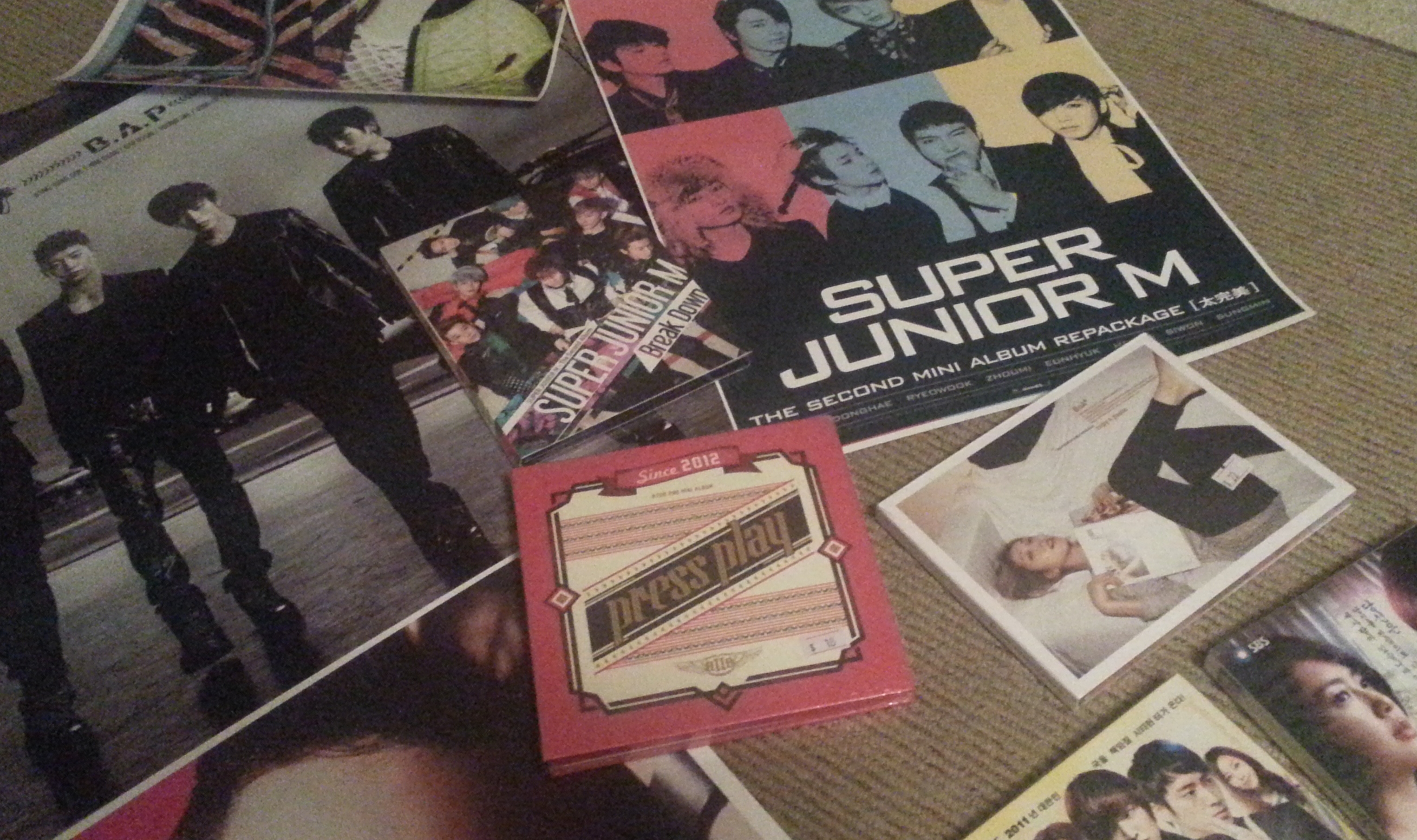
That red one in the middle? Insane.
And that’s that. I’m still kind of reeling here. In this era of increasingly popular digital download services for all kinds of entertainment, when a high percentage of videogame cases don’t even come with manuals anymore, I am truly startled to admit that the joy of the fresh physical media purchase hasn’t evaporated. It’s just moved east. And then mutated into something else entirely. I love it.

