
Let’s kick the negativity and move on to explore the best of the best that 2014 could offer in the realm of entertainment media, at least in my opinion. We begin with that highly subjective topic – what looks good on a videogame box. Here I put forward my specific 2014 view on the simple joys of appreciating the aesthetics of packaging, whether it be with plastic, cardboard or something else. I spent a lot of time looking at videogame cases this year, and these are my top ten favourites. Front cover art is naturally the most crucial part of weighing these up against each other in my eyes, but the rest of the case is important as well. Happy viewing!
.
-◊-◊-◊-◊-
VR BEST OF 2014 DISCLAIMER
This list represents my opinion only. I am not asserting any kind of superiority or self-importance by presenting it as I have. My opinion is not fact. If you actually agree with me 100%, that’s spooky. Respectful disagreement is most welcome.
-◊-◊-◊-◊-
.
10. LEGO Batman 3: Beyond Gotham

LEGO Batman 3: Beyond Gotham brings together a ridiculous amount of comic book characters from the DC Universe, sending them into space via the conceit of the various superpowered Lantern Corps. And what better way to showcase this fantastical set-up than with a suite of colour-soaked space action shots blending seamlessly with the titular hero’s billowing cape? I dig the hell out of this visual design choice, as it also affords the artists the ability to line up some of the more well-known DC characters in a more grounded fashion on the case’s lower half. Nice.
.
9. Bayonetta 2
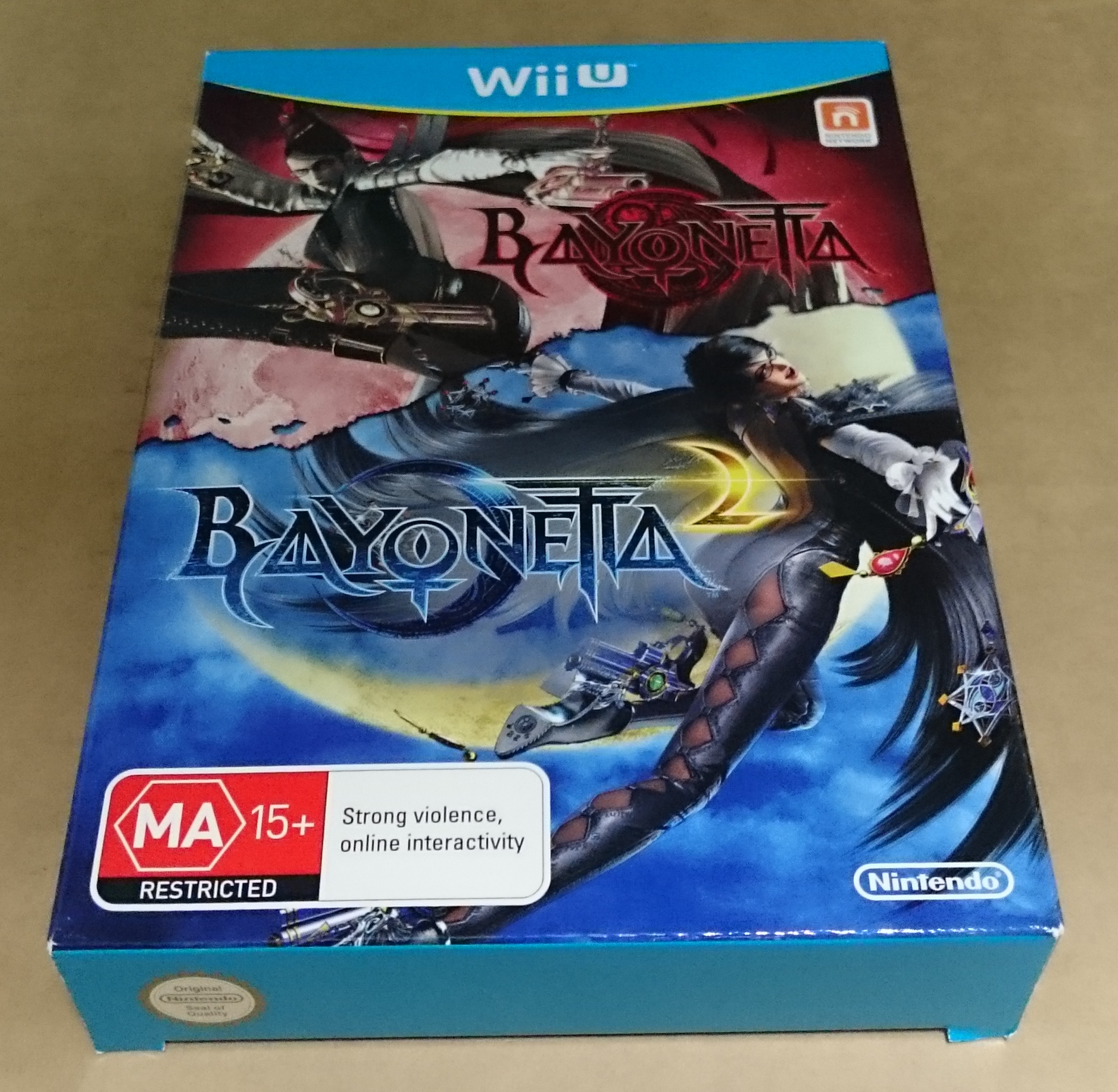
As you might guess if you’ve viewed my version of this list from 2012 or 2013, I’m a big fan of cases that present different shapes and/or dimensions from the norm, especially if those cases come as a standard SKU. Each and every retail copy of Bayonetta 2 so far ships in a cardboard box twice the depth of a standard Wii U case, as the original Bayonetta is included in the purchase price, and with its own disc to boot! Though I’m not a gigantic fan of the rustic tear down the middle, the prominent contrast of colours in the two logos is pleasing. It’s the unexpected packaging effort, however, rather than the face design per se, that gets Bayonetta 2‘s case onto this list.
.
8. Danganronpa 2: Goodbye Despair

The first Danganronpa game to be released in the west, Trigger Happy Havoc, somewhat unbelievably hit Australian stores this year, all the way back in February. Yet its uniquely twisted brand of head-screwing, morbid-and-also-funny personality was completely and totally squashed by its awful, awful cover, which exhibited precisely none of the game’s charm. Its extremely rapid sequel, however, changed all that, and how! The tropical flavour of the game is instantly apparent, you can actually see all of the main characters and the series’ magnetic mascot, Monokuma, is featured in a highly prominent position. The flowers almost appear to be blood-soaked as well, which is quite pertinent indeed.
.
7. Sunset Overdrive
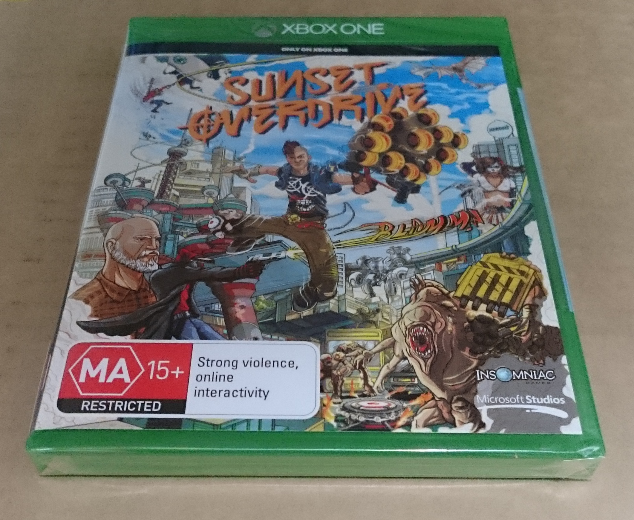
Colour, thick-lined cartoon stylings and ridiculous action define the joyful case of Sunset Overdrive, which unsurprisingly sums up the insanely over-the-top Xbox One exclusive rather well. The prominent positioning of the game’s mutated menace with the interchangeable human characters and motion lines aplenty do a great service to the marketing of the manic open world action game. And then there’s the title, all graffiti-splashed in bright orange right under the emerald green banner of the Xbox One logo – it just works, if you ask me.
.
6. Super Smash Bros for Wii U

Speaking of motion lines, the cover of the much-anticipated fifth Super Smash Bros game is bursting with them, amplifying the typical sense of urgency a Nintendo fan feels when seeing this game on a shelf. Every character has his or her game face on, ready to launch all manner of rivals into oblivion. The energy and excitement is palpable. The cover’s radial design, with the logo set squarely in the middle, is a perfect representation of what Smash is, and what’s really impressive to me is that it isn’t just a copy and paste of the 3DS version’s cover art – It is Samus, rather than Link, who takes centre stage on the cover on this version. Then there’s the back of the case, a celebratory mosaic of character portraits that does a great job of showcasing the wealth of content in the game.
.
5. Persona 4 Arena Ultimax

I feel like the case for Persona 4 Arena Ultimax, released in Australia literally a day before the new Super Smash Bros, outdoes Nintendo’s brawler at its own game, taking a similar design idea and turning it up to eleven. The typically Japanese bells-and-whistles excess of the game’s visual presentation, all excitement and creepiness, is captured in fittingly disorienting fashion on the game’s front cover. All twenty of the game’s characters squeeze their way onto a piece of art so bonkers that your eyes don’t fully trust that the logo isn’t just going to fly off the plastic. Sure, the weird 1990s IGN splash isn’t the greatest thing in the world, but I love this cover.
.
4. Lara Croft & the Temple of Osiris: Gold Edition
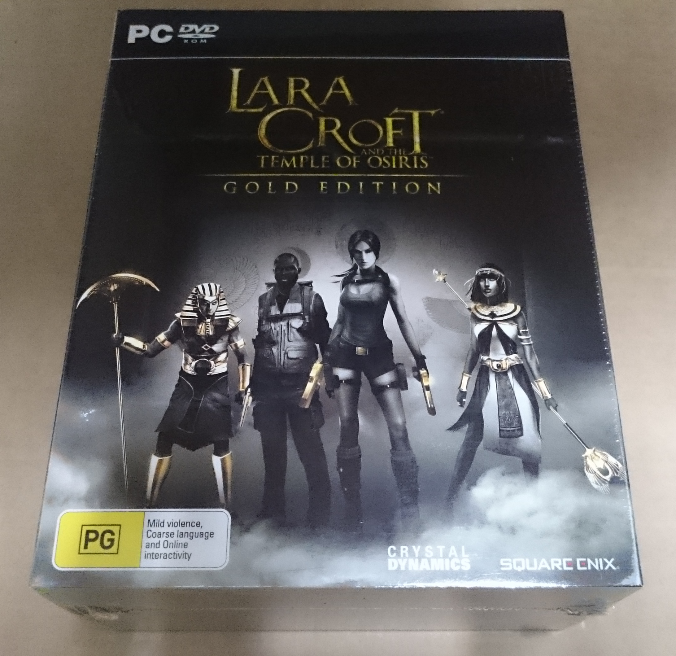
Normally a downloadable game, Square Enix made the interesting decision to release this month’s Lara Croft and the Temple of Osiris concurrently on a disc inside a hefty collector’s box stuffed with goodies. This effectively means you’re getting a limited edition as a standard retail SKU, and don’t it just look so purdy! Minimalist gold on black never goes out of style, and the milky grey tints that make up the rest of the adventure-ready front image blend nicely into one another, also serving to draw attention away from the logos at the bottom right. The back and sides of the box continue the minimalist approach, conveying a sense of the unknown with class.
.
3. Gone Home: Collector’s Edition
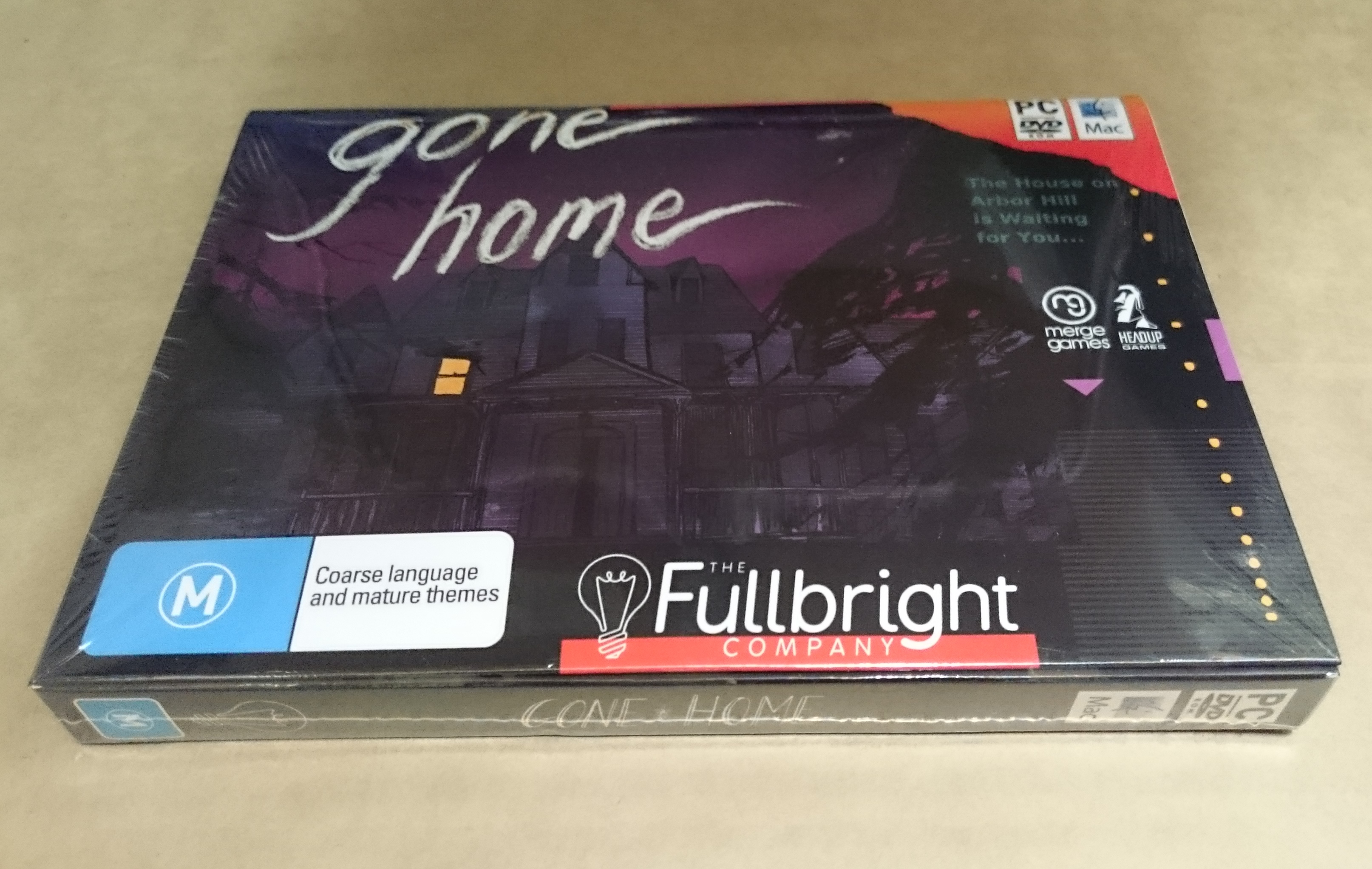
Gone Home may have been released in 2013, but it wasn’t until this year that it saw a physical release in stores, and my what a physical release it is. Anyone who has played the creepy narrative-driven indie gem knows that it preoccupies itself with making you feel like you are being transported back to the ’90s, the age of grunge rock mixtapes, bulky electronics, grandiose over-stickering of things and, of course, Super Nintendo videogames. Of course Gone Home lacks the licensing muscle to portray actual SNES game boxes inside the experience, so it makes do with an approximation that echoes this physical box. The super-nostalgic packaging is an awesome way to set the tone of the game before you even think about installing it.
.
2. Pokemon Omega Ruby
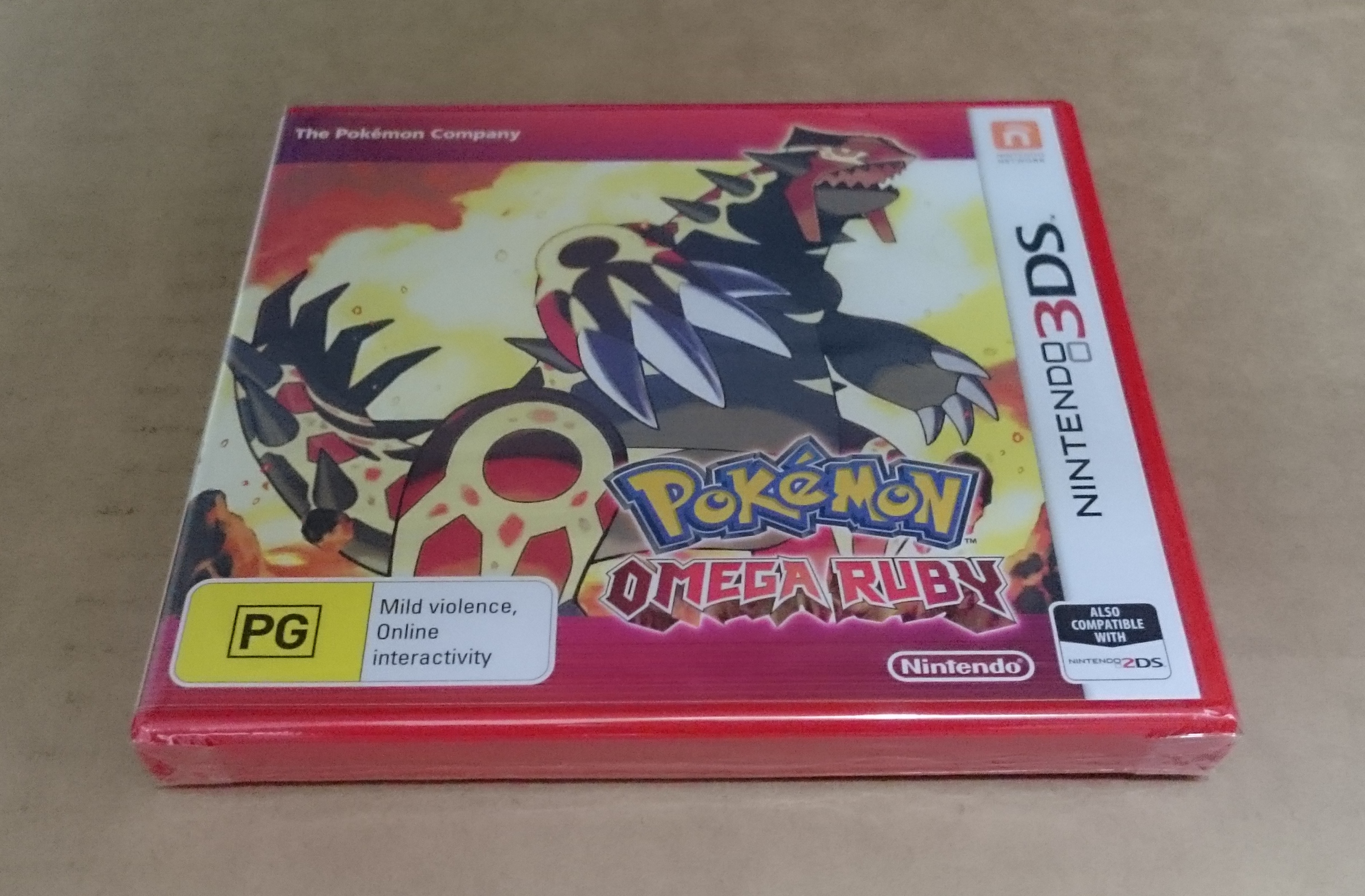
My top two entries this year are pretty much there for the exact same reason. Whenever Nintendo makes the effort to ship a game, especially a hugely anticipated one, inside a case made from uniquely coloured plastic, I just lose it. See my 2012 list. Whenever a new Pokemon game is released, you just know the back of the case is going to be well laid out and colourful, and the front will be squarely focused on a single monster without much in the way of clutter. It’s going to look good. But take that recipe and add a matching colour for the case itself, and you have a real standout piece of physical marketing. The red of Omega Ruby (the version I picked up) is simply striking against the standard white banner of the 3DS cover, but the weird choice to add a purple tinge marks it down just enough to concede my 2014 Number 1 spot to…
.
1. Pokemon Alpha Sapphire

… Because there’s just something about deep blue on bright white, and because the artistic vision of Primal Kyogre cruising above a deep sea ravine is just a little more cohesive to me. Nintendo, your visual design department has done it again.
.
.
-◊-◊-◊-◊-
Honorable Mentions
.
–Kingdom Hearts 2.5 HD ReMIX
I may not fully understand who is who on the front cover of Square Enix’s insanely high-value fanservice package for lovers of Kingdom Hearts, but there’s a pleasing symmetry and vibrant tone to the portraits that litter its face. In time, perhaps, it will make more sense to me.
—Mario Kart 8
Upside down, rightside up, colour everywhere, expressive character faces – This is modern Nintendo cover design to a T. The back cover is typically nice to look at as well.

